KABOOM!
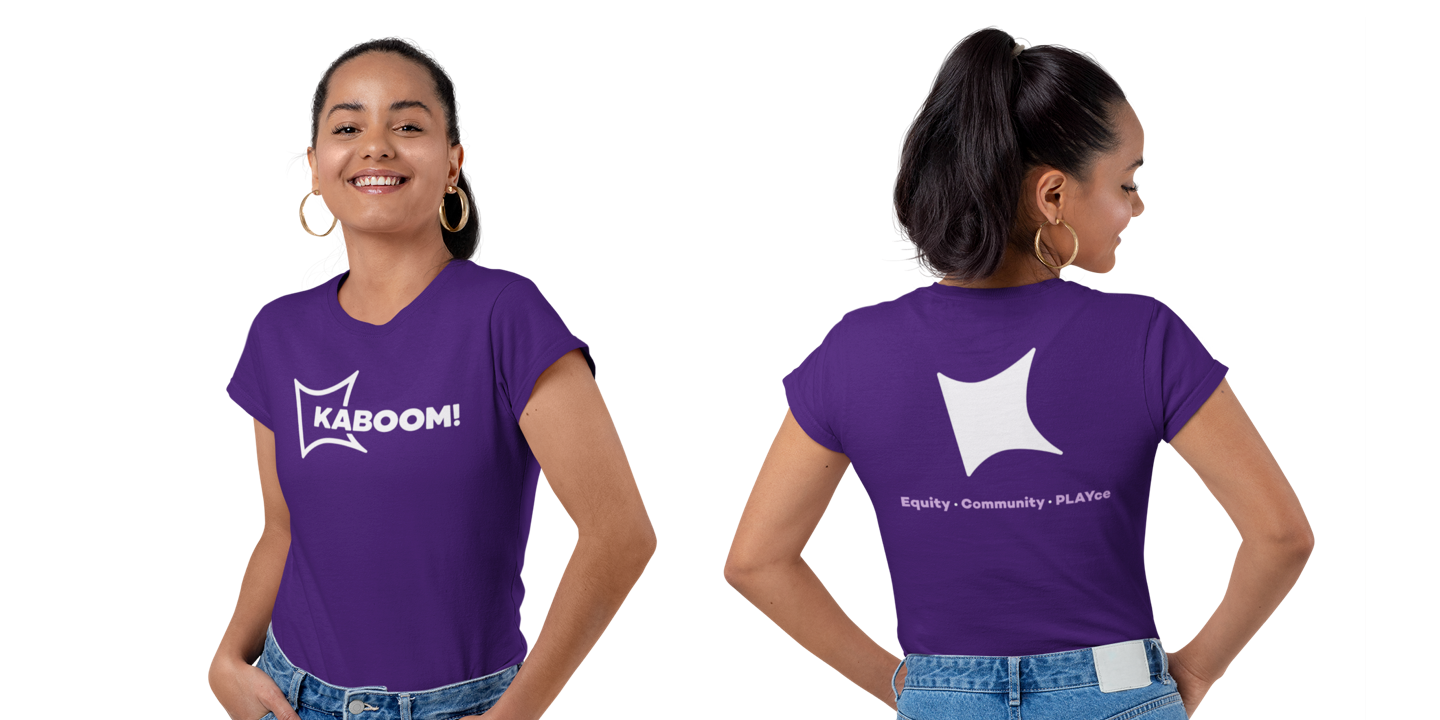
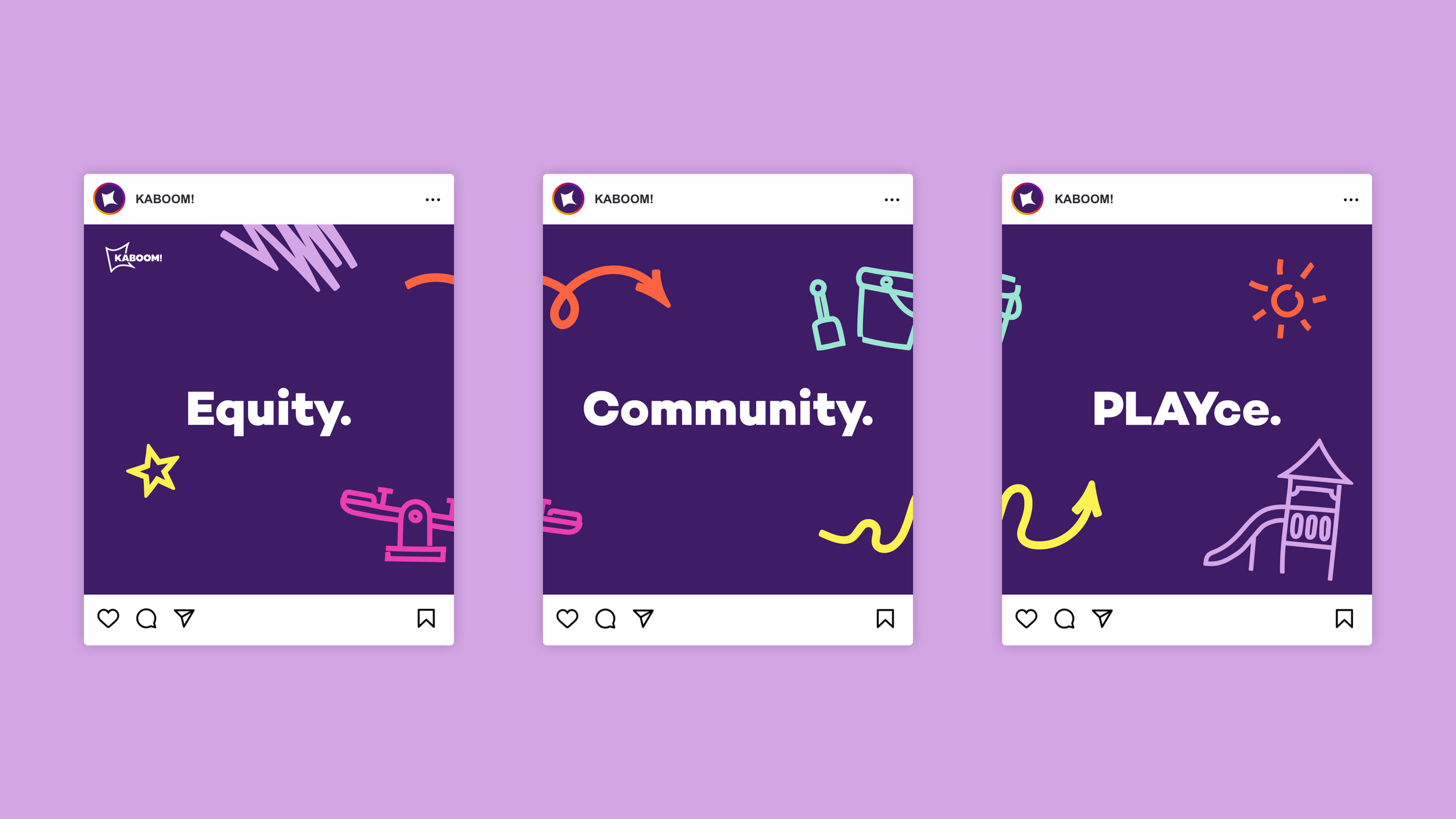
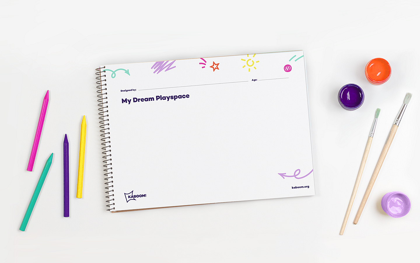
KABOOM! works with communities to build playgrounds in places that are often denied, so that every kid has access to play. After over 20 years of working in this sector, the nonprofit wanted to evolve its brand to better match its reputation and underscore its focus on playspace equity. The creative strategy for this new direction was to take the existing logo from ‘comic book’ to ‘graphic novel’. It was important for the system to be flexible enough to appeal to communities, partners, and funders, and the logo allowed KABOOM! to tell a story without being overly literal. To help achieve this, the new logo incorporates an abstracted “K” and alludes to the spark for playspace equity. The identity system retains some of the playful elements and the spirit of the old brand and is balanced by characteristics that feel current and more mature.
Role —
Design Lead
Awards —
Indigo Awards | Design for Social Change
Silver in Branding, 2021